
9 Color Combinations Nature Always Gets Right
9 Color Combinations Nature Always Gets Right
For years I felt like choosing colors that work well together felt super complicated—until you stepped into my garden.
Nature combines colors without making them feel forced. Some are quiet and grounding, while others are bright enough to stop you in your tracks. A wildflower doesn’t consult a color wheel before opening, but somehow its petals, center and foliage all belong together.
My background in horticulture has given me years of opportunities to notice these relationships. Color in nature is rarely flat or perfectly uniform. Leaves contain several greens. Stones have veins, inclusions and shifts in tone. A bird’s feathers can move from blue to green as the light changes.
That natural variation is part of what makes these combinations so interesting—and why they translate so beautifully into jewelry.

1. Forest Green and Earthy Brown
Walk through a wooded area and this pairing is almost everywhere: green leaves against bark, moss growing over fallen branches and new plants emerging through the soil.
Green and brown work because both feel grounded and familiar. The green provides life and freshness, while brown adds warmth and stability.
In jewelry, this combination might appear through mossy green stones, earthy beads, copper-colored metal or natural wood. It pairs especially well with denim, cream, camel and other relaxed neutrals.
This is an easy color combination for someone who loves nature but doesn’t necessarily want bright or highly contrasting jewelry.
2. Turquoise Blue and Sandy Beige
Blue water meeting a sandy shoreline creates one of nature’s most calming color combinations.
Turquoise brings freshness and energy, while beige softens it. The result is colorful without being overwhelming. Variations of this pairing can be found in oceans, desert skies, pale stones, shells and weathered wood.
For jewelry, turquoise blue becomes especially wearable when balanced with tan, ivory, warm metal or translucent neutral beads. It can add color to an outfit without competing with everything else you’re wearing.
Try it with white linen, light denim, khaki or a simple neutral dress.
3. Violet and Leaf Green
Purple flowers surrounded by green foliage illustrate a basic color relationship beautifully. Purple and green sit in striking contrast, but they still feel natural because we see them together so frequently in gardens and wild landscapes.
Think of violets, lavender, irises, asters and ornamental sage.
The amount of each color makes a difference. Deep purple paired with dark green feels rich and dramatic. A softer lavender with sage green feels quieter and more delicate.
In jewelry, green can serve as the supporting color while violet becomes the focal point—or the relationship can be reversed for an earthier effect.
4. Golden Yellow and Deep Blue
Few combinations feel as cheerful as sunlight against a deep blue sky.
Yellow is naturally energetic, while blue provides a strong, calming foundation. We also see versions of this pairing in wildflowers, birds and the golden light that appears just before sunset.
In jewelry, a small amount of yellow or gold can be enough. A golden bead, warm metal detail or yellow stone can stand out beautifully against navy, cobalt or muted blue.
This pairing works particularly well for someone who wants noticeable color without using several competing hues.
5. Rust Orange and Sage Green
Rust and sage are common companions in dry landscapes, seed heads, autumn foliage, lichens and weathered plant material.
They are nearly opposites in character. Rust feels warm and energetic; sage feels cool and subdued. Because both are softened versions of brighter colors, neither overpowers the other.
Copper naturally fits into this palette and can become even more interesting as its surface develops character over time.
Rust and sage jewelry works well with cream, olive, chocolate brown, denim and many of the warm neutrals people already have in their wardrobes.
6. Coral Pink and Aquatic Blue
Coral pink and blue appear together in tropical flowers, sunsets reflected on water, shells and marine environments.
This combination feels more playful than many earth-toned palettes, but it still has a natural reference point. Blue cools the warmth of coral, while coral keeps blue from feeling too reserved.
For a softer interpretation, pair dusty coral with pale aqua. For something more expressive, combine saturated coral with turquoise or teal.
This is a particularly good palette for spring and summer jewelry, although darker versions can work throughout the year.
7. Black and Iridescent Blue-Green
Beetles, butterflies and bird feathers demonstrate that black does not have to feel plain.
Against black, iridescent blue, green and violet appear even more vivid. In some natural surfaces, those changing colors are created by microscopic structures interacting with light rather than pigment alone. That is why a feather or wing may appear to change color as you move it.
In jewelry, a dark foundation gives reflective glass, metallic finishes and shifting colors room to stand out. The result can feel dramatic without requiring a complicated palette.
This combination works especially well in earrings because movement allows reflective surfaces to interact with the light.

8. Blush Pink and Burgundy
Nature frequently places lighter and darker versions of the same color together.
A flower may open with pale pink petals and deepen toward burgundy at its center. Autumn leaves can move from rose to wine as their colors change. Because the hues are related, the combination has contrast without feeling disconnected.
In jewelry, blush keeps burgundy from becoming too heavy, while burgundy gives pale pink more depth. Warm copper, antique brass or soft gold tones can complement both colors.
This pairing can feel romantic, botanical and sophisticated without becoming overly sweet.
9. White and Botanical Green
White flowers against green leaves may be one of nature’s simplest combinations, but simple does not mean boring.
Magnolias, daisies, dogwoods and many other flowering plants use this contrast. White provides a visual pause while green supplies shape, texture and life.
In jewelry, white glass, shell, pale stone or translucent beads can create a fresh contrast with leaf green, olive or deep forest tones.
This palette is easy to wear because it works almost like a neutral. It can complement colorful clothing while still having enough definition to be interesting on its own.

What Nature Understands About Color
The success of these combinations isn’t just about placing two colors next to each other. Nature also varies their proportion, intensity, texture and placement.
A landscape may contain a large field of green with only a few yellow flowers. A bird may be primarily brown with one brilliant patch of blue. A stone may look neutral from a distance but reveal delicate veins of rust, cream or green when viewed closely.
That is useful when choosing jewelry. You don’t need equal amounts of every color. Often, one dominant color and one smaller accent produce a more interesting result.
Texture matters too. A polished stone reflects color differently from frosted glass. Copper contributes warmth differently from a brown bead. Natural variation keeps a palette from looking overly coordinated or artificial.
Let Nature Help You Choose Jewelry
If you’re uncertain about combining colors, begin with a natural setting you already love.
Maybe it’s a forest after rain, a desert at sunset, a field of purple flowers or sunlight moving across blue water. Notice the dominant color, the quieter supporting tones and the small accents that catch your attention.
Those same relationships can help you select jewelry that feels personal rather than simply fashionable. Nature offers an almost endless source of palettes—and it rarely limits itself to colors that happen to be trending this year.
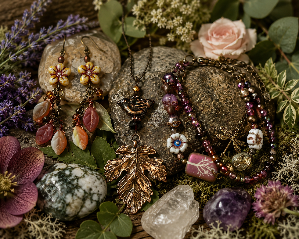
Explore the Raccoon Designs collection to discover jewelry inspired by the colors, textures and details of the natural world.
Questions About Choosing Jewelry Colors
Does my jewelry need to match my clothing exactly?
No. Jewelry can repeat one color from your outfit, introduce a complementary color or provide contrast against a neutral background. Coordinated is usually more interesting than perfectly matched.
How many colors should one piece of jewelry contain?
There is no fixed rule, but two or three main colors are often enough. Natural stones and handmade beads may contain subtle variations that add depth without reading as additional colors.
What if I usually wear neutral clothing?
Neutral clothing creates an excellent background for colorful jewelry. Forest green, turquoise, violet, rust and deep blue can all add interest without requiring you to change the rest of your wardrobe.
How do I choose colors for a jewelry gift?
Look at the colors the recipient wears most often and the parts of nature they enjoy. A gardener, birdwatcher, beach lover or desert traveler may naturally connect with very different palettes.


Comments